Reporting
The analysis layer your program runs on, reading the same data the rest of Affinity produces
Affinity's Reporting module is the analysis surface for the rest of the platform: dashboards composed from program-specific widgets, an Analyze view that opens from any candidate or sample list to compare them side by side, a scoring profile editor for defining how the team ranks leads, and report pages for the cross-candidate views stakeholders want to see. Every surface reads from the same registry the rest of Affinity writes to, so that the dashboards, rankings, and reports all remain current instead of sitting in a separate BI stack that has to be synced regularly.
Analysis that lives where the data does
Analysis usually lives a layer away from the work it describes. The registry holds the campaigns, reagents, clones, assay runs, and inventory that make up the team's day; the dashboards, rankings, and leadership reports tend to live somewhere else: a BI tool, a folder of exported spreadsheets, connected back to that data on a schedule. Plenty of teams run that setup and run it well. What it asks for is a second system to build and maintain, plus a sync to keep honest, since a scheduled copy is current only as of its last refresh. When a number matters, someone has to confirm it still reflects the bench before the team can act on it.
Affinity removes the second system. Reporting is a first-class layer of the platform, not a separate stack: dashboards, side-by-side comparison, scoring profiles, and report pages all read directly from the same registry that captures the discovery, molecular biology, production, analysis, and inventory work. Nothing is copied and nothing has to be synced, so the analysis is current by construction. The dashboard a program lead opens Monday morning already shows the assay results that came off the plate reader Friday afternoon, the ranked candidate list reflects the profile the team agreed to last week, and the leadership review pulls its numbers straight from the registry.
Click here to download the StackWave Affinity LIMS presentation
You shape the dashboard the program runs on
The anti-CD20 program just landed its first round of hits. The program lead's job for the morning is to build the dashboard the team will run their weekly review from: a single page that shows where each candidate stands, how the panel is trending, and what's coming next.
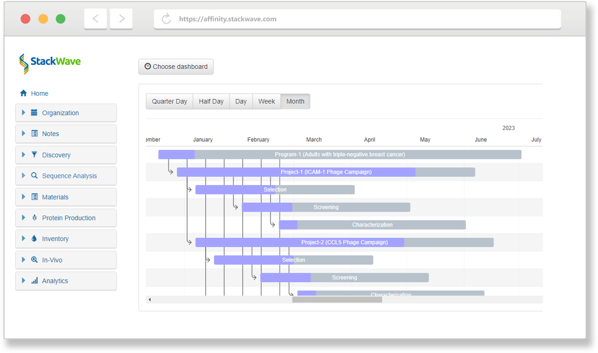
The program lead starts from an empty dashboard and lays in the views the team actually reads off: the program's antibodies as a ranked list, the projects and their phases on a timeline, assay throughput as a trend line, the headline numbers each paired with its change since last week, all sized and placed to match how the team reads the program. That candidate list can simply show the program's antibodies with the columns that matter, or rank them with a scoring profile that re-orders itself as new data lands, so the one view serves equally as a search tool and as a live leaderboard. When the layout is right, the program lead rolls it out org-wide so the whole team works from the same view.
You compare the round's hits side by side
Round four of the panning campaign produced a couple of dozen hits across multiple plates. The work now is figuring out which ones to take forward, and that means looking at every hit's binding data, sequence, and lineage in one place.
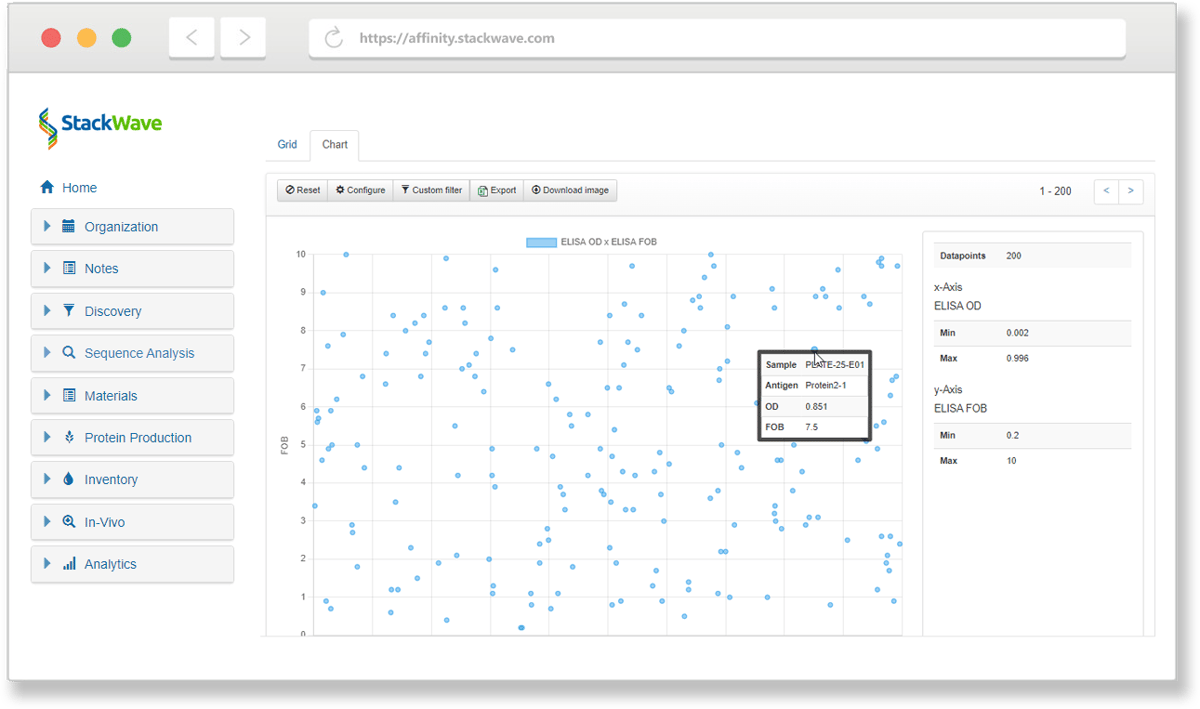
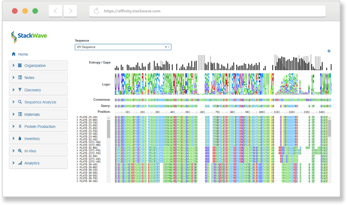
A scientist loads the list of hits side by side in one workspace. One view lays every candidate out as a row and pulls in the data that the decision needs: ELISA reads, BLI kinetics, and framework and CDR annotations, all presented in a single searchable table with built-in plotting capabilities. A companion view aligns the same candidates' heavy or light chains, so the sequence differences sit one toggle from the numbers. The comparison that used to mean three tabs, two exports, and a spreadsheet happens in one place, against live data.
You define how the team scores its leads
The hit comparison narrowed the candidates from a few dozen to a few that look promising. The next move is locking in what the team considers a "good" candidate, weighted by which criteria and what thresholds matter, so the ranking the team works from is the ranking the team agreed to.
A scoring profile is that definition. Its criteria are the things that actually decide the call: binding tight enough, expression high enough, the sequence clean of liabilities. The criteria carry the direction that counts as good, how much each one weighs against the rest, and the goal to measure against. Because a program usually needs coverage as well as potency, the profile can spread the ranking across V-gene families or epitope bins, so the top of the list is a representative panel rather than ten versions of one clone. The profile belongs to the program, scoped to it and to the candidate format it applies to, so from here on the team ranks against one agreed bar instead of a series of spreadsheets in which each scientist weights a little differently.
You watch the ranked list refresh as data lands
The scoring profile is defined. Now the team's working surface for decisions becomes the ranked candidate list, a list they can open every morning to see where the panel stands.
The candidates come back ordered best to worst, each showing its score and how many of the program's goals it clears. A summary across the top says how many clear every goal and how well the panel covers its diversity targets. The list isn't a snapshot: when a fresh ELISA plate or a just-finished Biacore run lands, Affinity re-scores the affected candidates. The "top candidates" are always the current ones, because the list is a live view of the registry through the team's profile.
You build the report for the program review
Friday afternoon. The team's program review is in an hour, and what the director wants to see is the cross-candidate report of every clone the team is tracking, with the binding data, sequences, and potential liabilities on the same row, and a few candidates promoted to the next stage.
The program lead pulls that report in one place, and it spans all the formats that comprise the program: antibodies next to the nanobodies next to all the different bispecific formats, each carrying its own assay columns joined into the same table, the comparison a cross-format program needs and no per-format export can assemble. From the report, the standouts can be added to a named set the team can return to, and the chosen few promoted to the next stage, all without leaving the report.
How Reporting connects to the rest of Affinity
-
Discovery embeds reports and scoring profiles directly in its screening workflows, so plates are screened and panels of engineered constructs evaluated where the work happens, not in separate analytics software.
-
Bioregistry launches the Analyze view from every candidate list, so cross-candidate comparison is one click from wherever the candidates are browsed.
-
Inventory opens the same side-by-side comparison from its Samples page for cross-sample work and its Lots page for vendor-supplied lots.
-
Planning binds the dashboards built here to the Home page, so the team's landing page is whatever dashboard the team wired up.
-
Production and the other workflow modules feed assay results, expression yields, and process data into the same registry the dashboards and reports read from, so the numbers are always one query away from the work that produced them.
Why choose Affinity for reporting
-
One registry, every analysis surface. Dashboards, the Analyze view, scoring profiles, and report pages all read from the same data the rest of Affinity writes to, so there is no nightly sync, no separate BI stack, and no exports that drift away from the source.
-
Analysis you can act on, not just read. Promote the standouts to the next stage and add them to a named set the team can return to. The decision and the record of it happen in one place, without an export-and-re-import round trip.
- Binding data and sequences, one toggle apart. The Analyze view pairs an assay-data report builder with multiple sequence alignment, so the numbers that rank a candidate and the sequence differences that help explain them sit in the same window instead of two tools.
-
Cross-format comparison. Analysis can put antibodies, scFvs, nanobodies, and any other format you design in the same report, useful when a program is evaluating a panel across formats and the comparison columns have to span per-format assay tables.
-
Transparent pricing. $175 per user per month, every module included. The Reporting module isn't an add-on tier and the dashboards aren't a separate license.
-
Founded in 2011, focused exclusively on biologics R&D — more than a decade of building the analysis layer the scientists who actually use it ask for.
Manage your entire process, from discovery to lead characterization
With Affinity, it's never been easier to collaborate effectively on drug discovery and development. Spend more of your time on discovery instead of data entry by using one solution that provides all of the tools you'll need. Request a demo or free trial today.
Collaborate
Facilitate collaboration between discovery, production, and analytics teams
Integrate
Fully integrated, from target identification to lead characterization
Consolidate
Single source of truth for all assay data
Analyze
In-depth analysis of lead antibodies
Learn more about our solutions for Biologics R&D
-
Sequence Analysis
-
Phage Panning
-
Lead Characterization
-
Hybridoma Production
Sequence Analysis
Leverage Affinity’s built-in sequence analysis tools to identify the unique antibodies in your discovery campaign results without having to license or build a separate bioinformatics system. Additional sequence search tools take advantage of Affinity’s sequence and variable region databases to quickly find related sequences.
Phage Panning
Phage panning allows you to narrow the enormous diversity represented by your phage libraries to a manageable set of antibodies for further study. Create visual designs of your phage panning experiment to track which combinations of antigens and other inputs produced the most promising leads. From the pools of phage output produced, generate sets of screening plates for assaying, sequencing, screening, and analysis.
Lead Characterization
StackWave Affinity provides workflows for phage, hybridoma, and single B-cell campaigns, assay data management, sequence analysis, custom reporting, and plate generation in a single solution. These tools integrate seamlessly to help discovery teams quickly identify their most promising lead antibodies. Automation support for liquid handling platforms and assay data ingest allows for high-throughput screening of campaign results.
Hybridoma Production
Manage the complexity of hybridoma campaigns with an actual animal study management solution that connects seamlessly with hybridoma plate generation. Generated plates can be screened, sequenced, filtered, and lead antibodies identified using an intuitive set of tools that combine assay data management, sequence analysis, and custom reporting.
"StackWave gives us confidence in our leads by collecting all of the data about our potential therapeutics in one place and making that data actionable by allowing us to compare antibodies of interest."
"I worked with StackWave for ~4 years at my previous job to implement our LIMS. It was a great learning experience. We put in place an incredible system for our entire workflow, from plasmid registration to in-vivo study data registration."
"StackWave’s Platform allowed us to collaborate on our in-vivo studies in a web browser at home... I would highly recommend StackWave for therapeutic discovery teams looking to improve collaboration between teams."